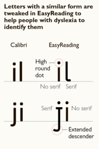
EasyReading Font
EasyReading font, designed by Federico Alfonsetti, from Turin, is the font explicitly “dedicated” to dyslexic readers. Independent scientific researches confirmed positive results. 10% of the population has some form of dyslexia which can affect their ability to decipher written information. My guess is, if EasyReading font helps people with dyslexia then it might be good for the rest of the population.
Other font designers tired to help people make reading easy on the eye. For example, on Kindle, you can choose OpenDyslexic font to speed read your ebooks. My criticism of OpenDyslexic font is that they got the bold emphasis on the bottom part of the font wrong since we know that the upper parts of the font have more visual cues, so the bolding would work better on the upper part of the font for legibility and readability.
“The results, which appear significant from both the statistical as well as clinical point of view, allow us to affirm that EasyReading can be considered a valid compensatory tool for readers with dyslexia and a facilitating font for all categories of readers”. The research was published in the scientific journal “Dyslexia. Italian Journal of clinical and applied research” (no. 2/2013), Published by Centro Studi Erickson, Trento
